Brand & Web Cat Poupança
Overview
Industry
Role
Brand & Web Designer
Timeline
Year
2025
Tools
Adobe Illustrator
Adobe Photoshop
WordPress
ElemeNTOR
01
Problem Definition
As Catarina’s project evolved, the existing visual identity and website no longer supported the level of credibility required for a trust-sensitive domain such as personal finance.
While the content and business had matured, the brand system remained visually inconsistent and lacked the structural clarity needed to communicate authority and reliability at first glance.
This created a systemic issue rather than a purely aesthetic one: the brand was underperforming in communicating its actual value.
02
Constraints & Guidelines
03
Strategy & Decision-Making Criteria
Three core principles guided decision-making throughout all design stages, directly reflecting the values and approach of Cat Poupança as a personal financial education business:
Rather than applying trends or predefined visual styles, these principles acted as strategic filters, ensuring each decision supported the business’s purpose and long-term positioning.
The design objective was to communicate authority through structure and coherence, not through visual complexity.
04
Process
Discovery
An initial conversation and strategic questionnaire were used to understand the motivation behind the rebrand, clarify objectives, and identify the foundations for the new visual direction.
Context & Insight
Collected insights were analysed alongside a review of the competitive landscape within personal financial education, establishing a clear context for differentiation.
Visual Direction
Based on this analysis, a visual direction was defined — balancing credibility, approachability, and long-term consistency.
Identity Development
The new visual identity was developed and refined, then presented for validation and approval.
Digital Translation
The approved identity was translated into a fully responsive WordPress website, ensuring visual coherence and usability across devices.
05
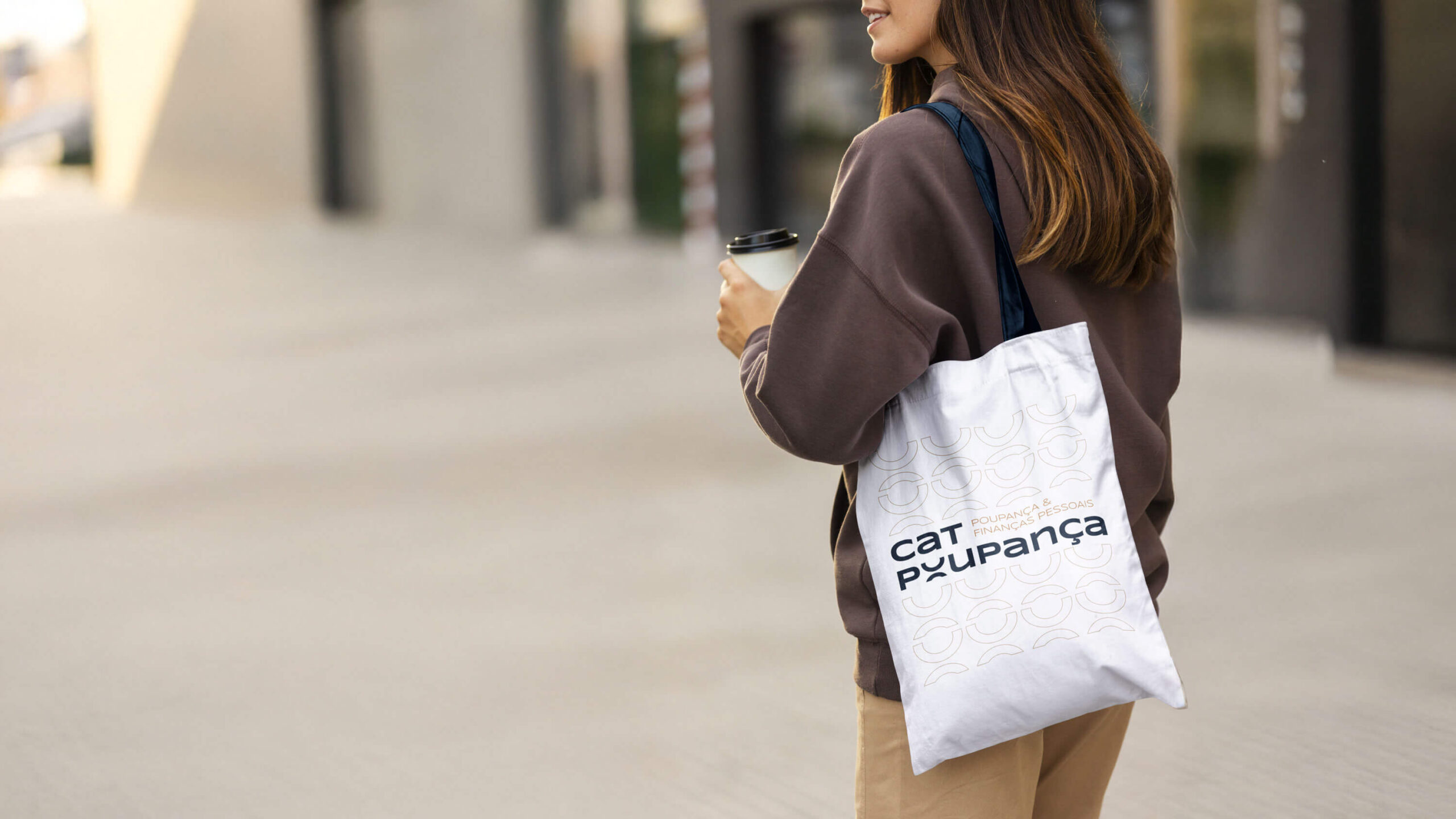
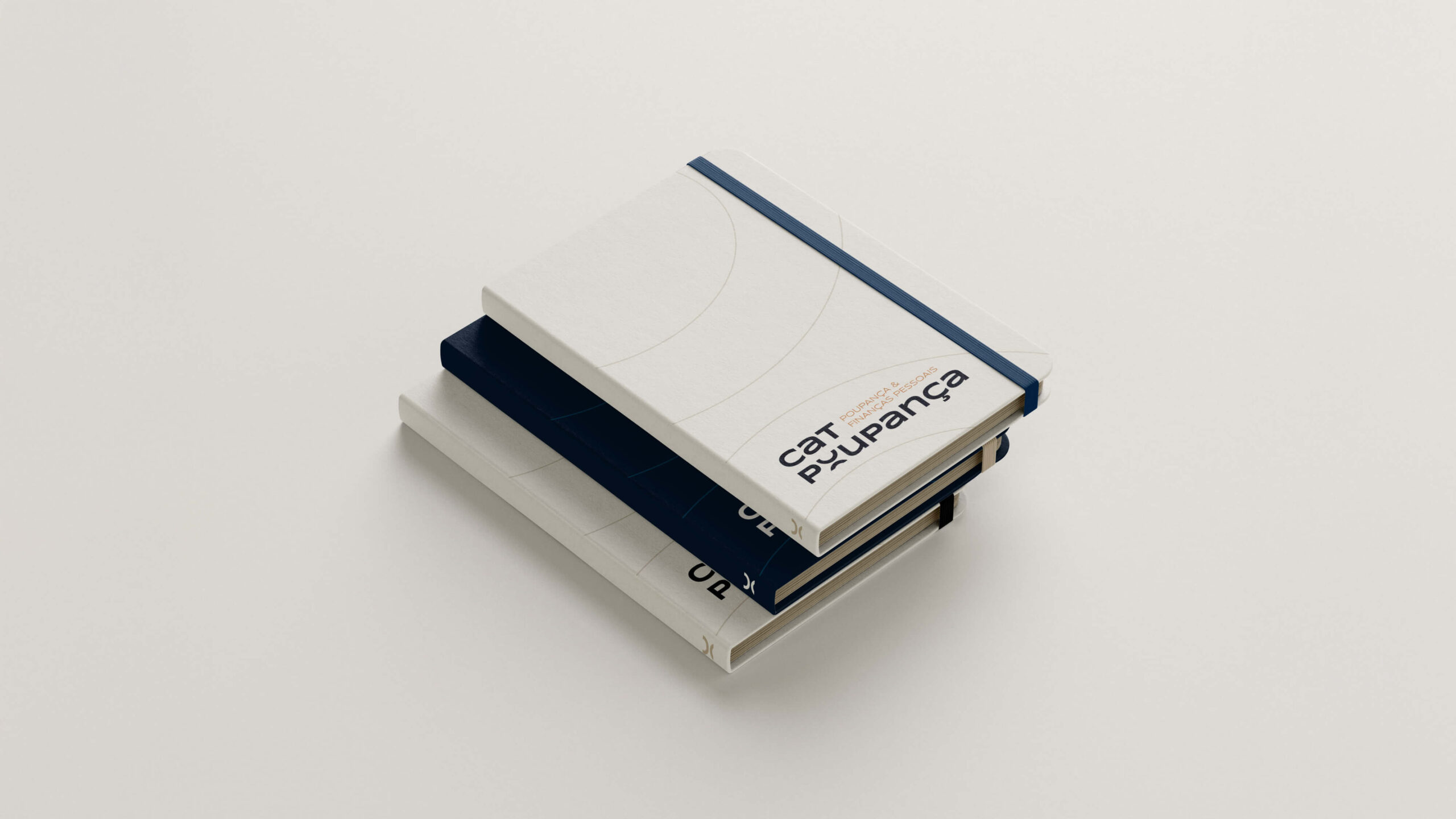
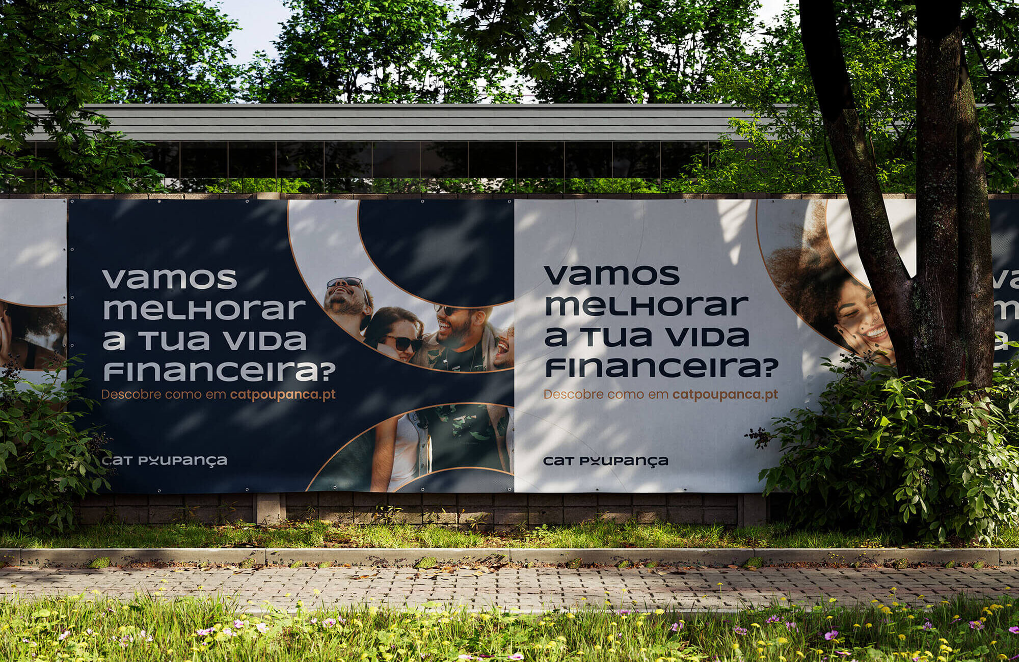
Branding
LOGO
- Lowercase typography reinforces proximity and reduces perceived distance.
- Consistent typographic height introduces visual discipline and rigor.
- Circular forms, derived from the logotype, reference savings, continuity, and financial cycles.
These elements work together to balance authority with approachability.
COLOR & TYPOGRAPHY
- Color serves a structural purpose: navy tones establish stability and trust, neutral shades maintain readability and restraint and warm accents provide emotional balance and brightness without reducing credibility;
- Typography supports messaging, creates hierarchy, and ensures clarity across all brand touchpoints.
Icon Version
Horizontal Logo
Main Logo

06
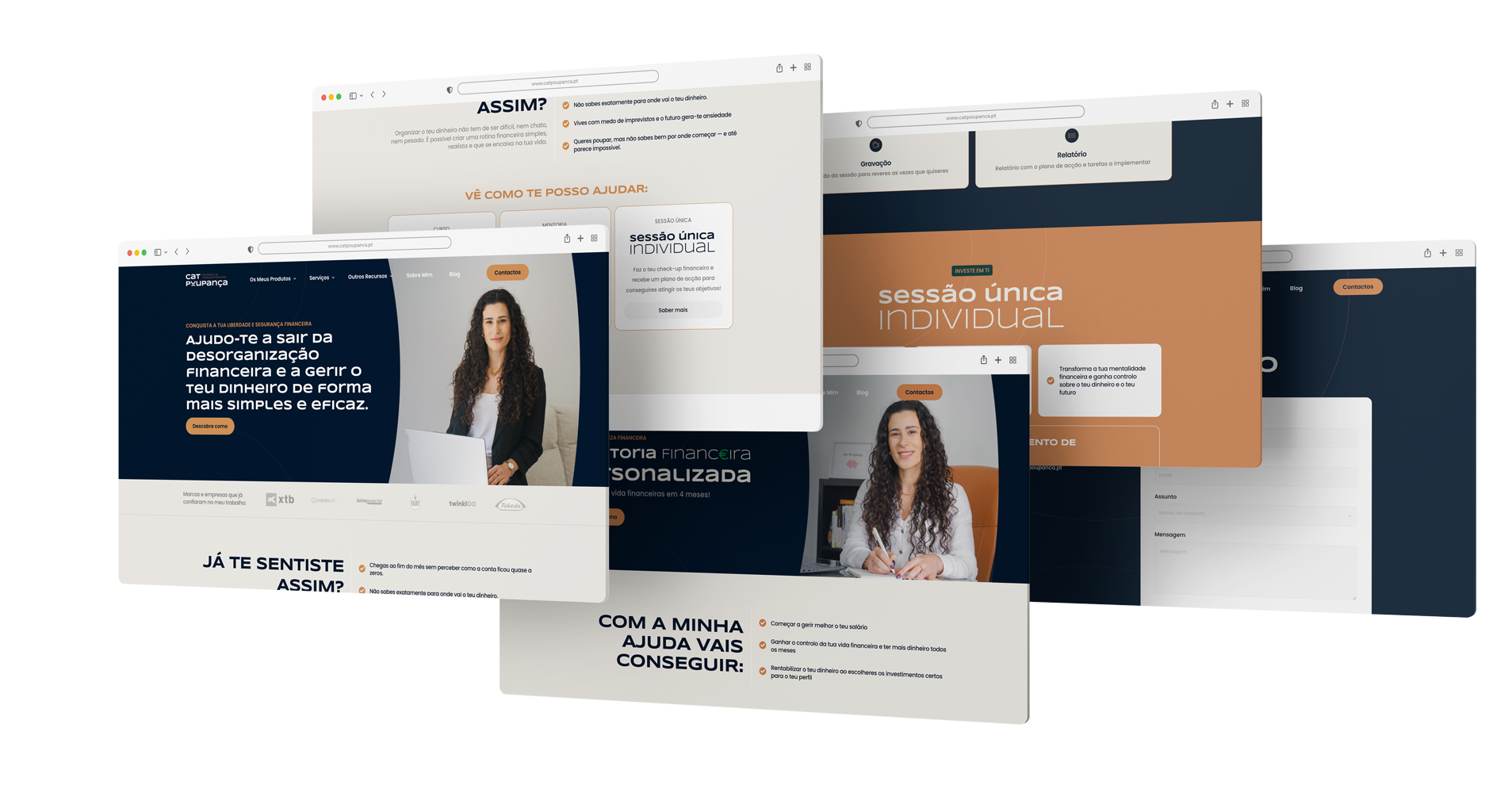
Website
The Cat Poupança website was designed to translate the new visual identity into a clear, approachable, and structured digital experience, reflecting the brand’s mission of financial guidance and trustworthiness.
Information Architecture
The website structure prioritises clarity and logical progression, guiding users effortlessly through Catarina’s services, testimonials, and personal story. Content flows intuitively, ensuring visitors can access the information they need without friction.
UX Principles
- Minimal Navigation: A clean menu and intuitive layout reduce cognitive load.
- Clear Hierarchy: Information is prioritised to lead users naturally through the site.
- High Readability: Typography and spacing were carefully considered to maximise comprehension and ease of reading.
UI Patterns
- Typography-Led Layouts: Hierarchy and emphasis are communicated primarily through type.
- Restrained Visual Elements: Decorative elements are minimal, allowing content to shine.
- Brand System Alignment: Every component follows the established visual identity, creating a cohesive and recognisable experience.
Responsiveness
The website was developed fully responsive, ensuring the design system maintains integrity and usability across all devices and screen sizes.
7
Key Outcomes
Cohesive and scalable system: The identity system is consistent and flexible, supporting future growth and communications.
8
Reflections
This project reinforced the importance of treating brand identity as a system rather than a collection of visual assets.
In trust-sensitive domains, credibility is built through clarity, consistency, and disciplined decision-making, not aesthetic complexity.
Design maturity, in this context, is defined by how well a system supports communication over time.