After ten years of growth, Faz e Come's visual identity no longer matched the depth, intention, and credibility the project had built. The challenge was to translate that decade of dedication and human connection into a coherent, contemporary brand identity.
Industry
Gastronomy · Food Content · Lifestyle
Role
Brand Designer
Timeline
October – November 2024
Year
2024
Tools
Adobe Illustrator
Adobe Photoshop
01
Problem Definition
While Faz e Come had grown significantly in content quality, consistency, and audience engagement, its visual identity no longer reflected the project’s current maturity.
The existing brand image belonged to an earlier phase of the project and did not fully communicate the depth, intention, and credibility developed over ten years.
This was not simply a matter of aesthetics. The challenge was to translate a decade of dedication, storytelling, and generosity into a coherent and intentional identity — one that felt contemporary, yet deeply rooted in the brand’s history and human connection.
02
Constraints & Guidelines
Several constraints guided the strategic direction and design decisions throughout the project:
Modernise the brand without compromising its approachable nature
Avoid an overly “gourmet” or distant aesthetic
Preserve visual familiarity for an established audience
Create a flexible system adaptable to multiple formats and platforms
Ensure the brand remained a true reflection of Rui as both creator and individual
Balancing evolution with recognition was essential to maintaining trust and continuity.
03
Strategy & Decision-Making Criteria
The identity was developed around principles that directly reflect Faz e Come’s purpose and values:
Human Proximity: At its core, Faz e Come is about connection. The visual language needed to feel welcoming and conversational — inviting people to gather, cook, and share.
Authentic Expression: Rather than following trends, the focus was on capturing Rui’s genuine personality: passionate, generous, and deeply involved in what he creates and shares.
Continuity & Sharing: Cooking, in this context, represents an ongoing cycle of creation and exchange. The brand system reflects this idea of continuity, repetition, and storytelling built over time.
These principles acted as strategic anchors, ensuring every design decision reinforced the brand’s long-term positioning rather than short-term visual appeal.
04
Process
The project unfolded through a structured yet fluid process, translating strategic insight into a cohesive visual and digital outcome.
Discovery
An in-depth analysis of the brand’s journey, values, and audience relationship established the foundations for the new visual direction.
Concept Development
Two distinct visual concepts were explored:
– one aligned closely with the existing visual language
– one more contemporary, minimal, and conceptual
The selected direction balances modernity with familiarity.
Identity Development
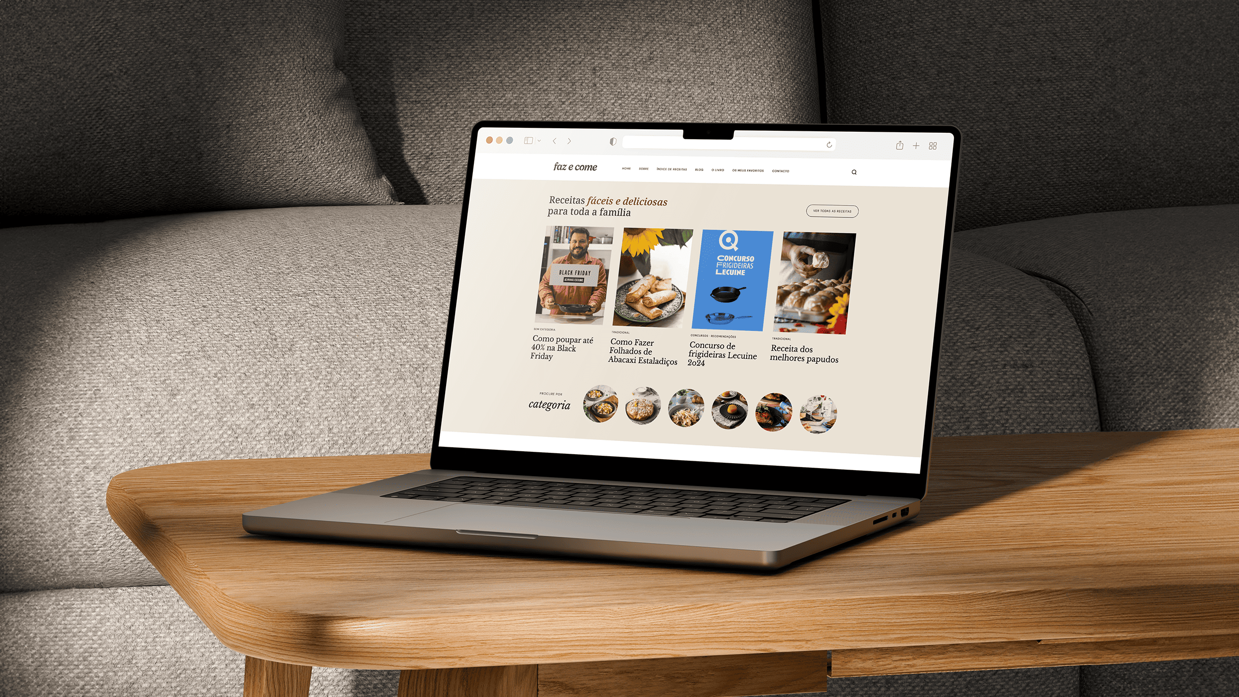
The chosen concept was refined into a complete identity system, including logo variations, colour palette, and typography.
System & Guidelines
A brand guide was developed to ensure consistency, clarity, and scalability across future applications.
05
Branding
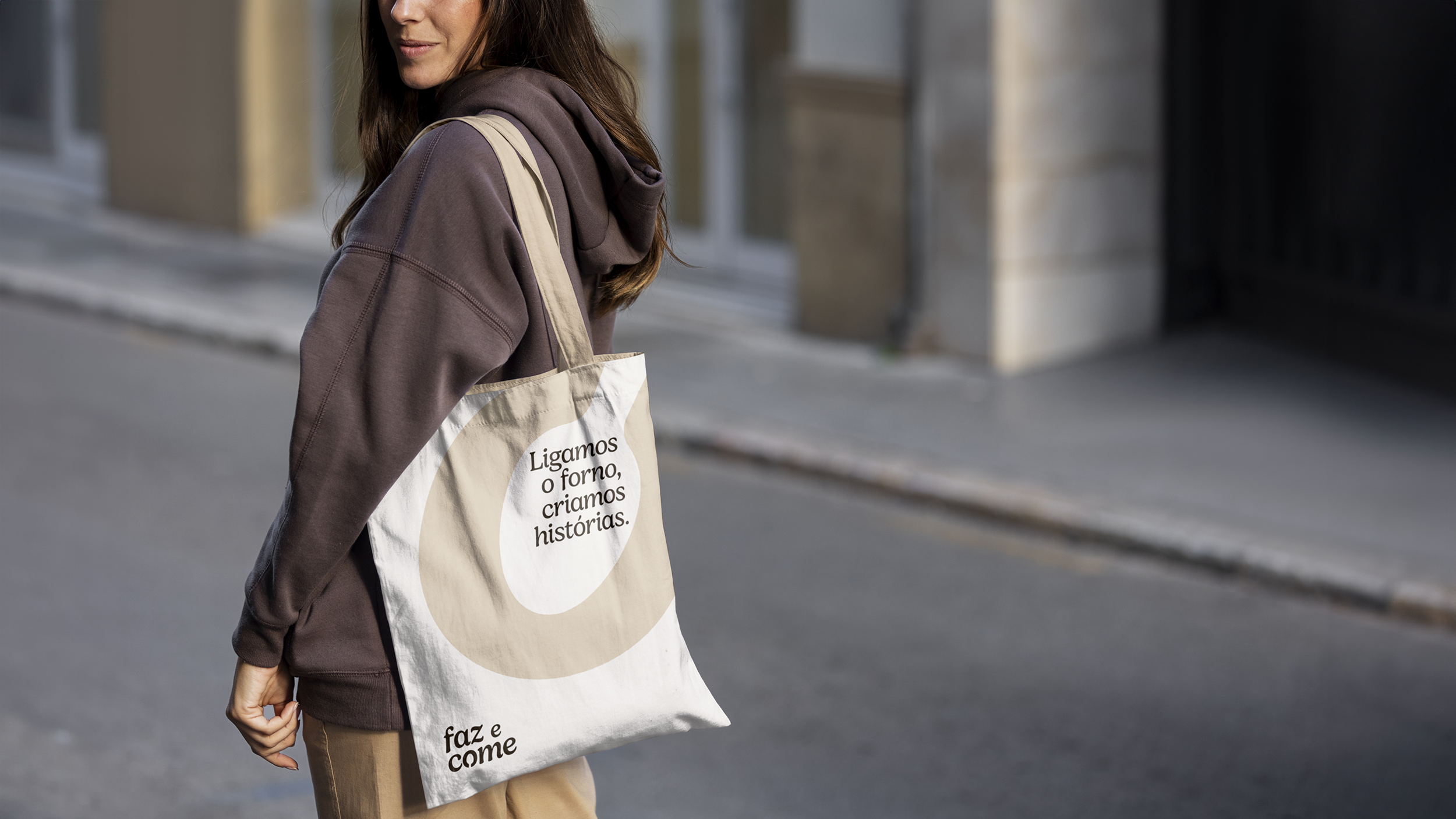
LOGO
Lowercase typography reinforces approachability and reduces perceived distance
Italic forms reference handwritten notes, recipes, and informal kitchen annotations
A subtle spoon integrated into the “O” symbolises tasting, sharing, and the intimate gesture of cooking
Circular shapes reference plates, cycles, and continuity
The logotype was designed to feel inviting rather than authoritative.
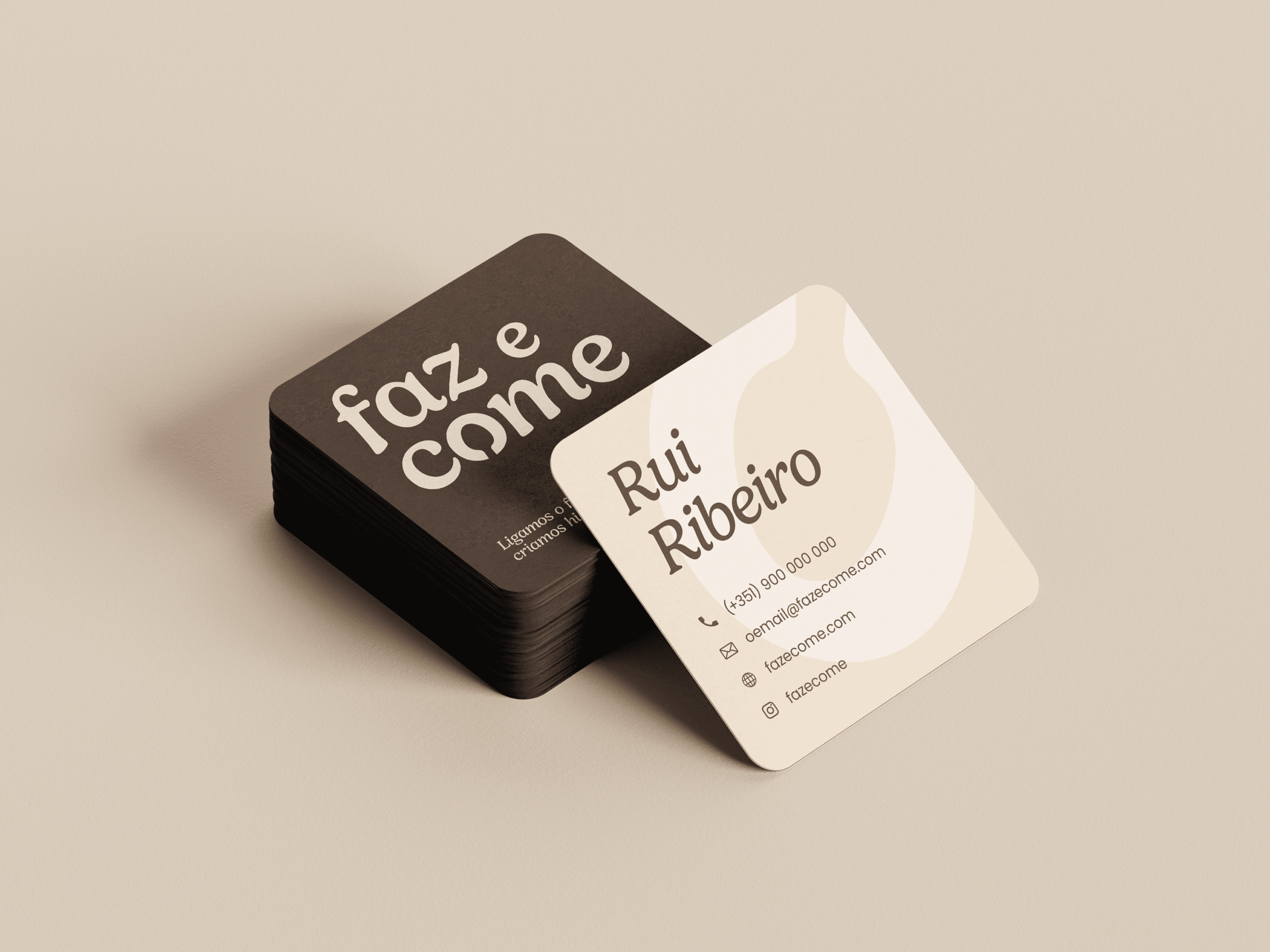
COLOR & TYPOGRAPHY Colour was treated as an emotional and structural tool:
Earthy browns and terracotta tones evoke warmth, comfort, and home cooking
Soft beige shades balance the palette and provide visual breathing space
A deep blue introduces contrast and visual stability without disrupting the brand’s warmth
The primary typeface adds personality and expressiveness, while the secondary typeface ensures clarity, hierarchy, and versatility across digital contexts.
Icon Version
Horizontal Logo
Main Logo
06
System & Applications
The identity functions as a flexible and coherent system:
Multiple logo configurations for different contexts
Icon and favicon versions for small-scale applications
Clear rules for contrast, spacing, and legibility
A defined typographic hierarchy
This approach ensures consistency while allowing the brand to evolve organically.
7
Key Outcomes
The new identity reflects not only Faz e Come, but also Rui’s journey, values, and creative dedication.
Stronger alignment between brand image and project maturity
Clearer and more intentional visual communication
A scalable identity system prepared for future growth
Increased client confidence in presenting the brand publicly
8
Reflections
This project reinforced the importance of treating personal brands as evolving systems rather than static visual assets.
In projects rooted in trust and emotional connection, design maturity is defined by clarity, coherence, and respect for the brand’s history.
The Faz e Come identity is not simply a redesign — it is a visual translation of a decade of shared stories, created to support what comes next.